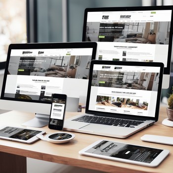
Designing a website with a focus on improving customer ease of use involves creating an intuitive, accessible, and efficient user experience. Every website has millions, if not tens or hundreds of millions, of other websites, competing for your potential customer's attention and money. Good enough" is not good enough in today's crowded digital landscape.
Here are some key principles and strategies to consider:
- Clear Navigation: Ensure that your website has a clear and consistent navigation structure. Users should be able to find what they're looking for with minimal effort. Use breadcrumbs, search functions, and logical menu structures to assist users in navigating your site. As a rule of thumb, all the most important information should be no more than ONE click away. If, for some reason, you can't make this work on your regular menu structure, consider using links or buttons ion your header area to get those important links front and center.
- Responsive Design: With the increasing use of mobile devices, your website must be responsive. This means it should automatically adjust to look good on all devices, including desktops, tablets, and smartphones. While this was once a great idea, it's now one of the major building elements for modern website design. Yet we still see old, non-responsive websites on the web. These companies clearly have no idea just how much that's hurting their online presence! Over 60% (as of 2024) of web traffic is on mobile devices.
- Load Time Optimization: As mentioned above, mobile-based web traffic accounts for more than half the volume. With many users still on 4G, or worse, 3G or LTE, load time becomes critical! Optimize images, scripts, and other elements to ensure your website loads quickly. Slow load times can frustrate users and lead to higher bounce rates.
- Intuitive Interface: Design an interface that is easy to understand. Use familiar design patterns, clear labels, and recognizable icons. Avoid complex or non-standard interactions that might confuse users. Don't hide menu items in unexpected places; for instance, we've seen the "About" page menu item under "Contact". Illogical and frustrating for users.
- Readable Typography: Choose fonts that are easy to read on screen. Ensure there is enough contrast between text and background, and use appropriate font sizes to accommodate different devices and user needs. Make sure your text is big enough to read comfortably across all devices.
- Accessibility: Make your website accessible to all users, including those with disabilities. Follow WCAG (Web Content Accessibility Guidelines) to ensure your site is navigable via keyboard, screen readers, and other assistive technologies. WCA G is a huge, but very important, topic that deserves more emphasis now, and will definitely do so in the future. It makes sense not to deliberately alienate part of your potential customer base by not making your site easily accessible to them. One quick note on this, though there are 2 diametrically opposed camps, we recommend avoiding those "make-your-site-WCAG-compliant: plugins. They can be problematic, and, while not yet challenged legally, could leave you exposed.
- Reduce Clutter: Keep your design clean and uncluttered. Too much information or too many elements on a page can overwhelm users and make it difficult for them to focus on what's important. White space is vitally important in helping users navigate your pages.
- Consistency: Maintain a consistent design language throughout the website. This includes consistent use of color, typography, and layout, which helps users recognize where they are and what they can do on your site.
- Helpful Error Messages: When users make a mistake or encounter an error, provide clear and actionable feedback. Tell them what went wrong and how they can fix it.
- Call to Action (CTA): Make sure your CTAs stand out and are easy to understand. Users should know exactly what will happen when they click on a button or link. Every page should have at least one CTA and it should be obvious - don't leave users guessing where it is or what you want.
- Content Organization: Organize content in a logical and hierarchical manner. Use headings, subheadings, bullet points, and short paragraphs to make content easily digestible. Also, as mentioned above, make good use of white space.
- Search Engine Optimization (SEO): While not directly related to the design, SEO ensures that your website is discoverable by users. Use relevant keywords, meta tags, and quality content to improve your site's visibility in search engine results.
- Feedback Mechanisms: Provide ways for users to give feedback about their experience on your site. This can be through contact forms, live chat, or feedback buttons. Use this information to make continuous improvements.
- User Testing: Regularly conduct user testing to see how real users interact with your website. Observe where they struggle and use these insights to make design adjustments. This can be done manually by asking for feedback, or by using heatmap technology to see where people are going and what they're doing.
- Personalization: Tailor the user experience based on individual user behavior and preferences. This can increase engagement and make the site more user-friendly for returning visitors.
By incorporating these principles into your website design, you can create a more user-friendly and enjoyable experience for your customers, which in turn can lead to increased engagement, higher conversion rates, and improved brand loyalty.
We understand there's a lot to take in and deal with in this modestly brief guide. Want to get your site professionally built/rebuilt, hosted, managed, and maintained? For nothing upfront? And just a low monthly subscription?


